
Python之Matplotlib库学习(1)
Matplotlib简介
Matplotlib是一个Python 2D绘图库, 可以生成各种硬拷贝格式和跨平台交互式环境的出版物质量数据. Matplotlib可用于Python脚本, Python和IPython shell, Jupyter笔记本, Web应用程序服务器和四个图形用户界面工具包.
Matplotlib库的安装
安装Matplotlib库的最快也是最简单的方法是在shell上使用以下命令:pip install matplotlib
一般使用时直接import即可import matplotlib.pyplot as plt
matplotblib.pyplot.plot()的使用
注意:
后文将用plt代替matplotblib.pyplot
matplotlib.pyplot 是命令样式函数的集合, 相当于快捷方式. 每个pyplot函数都可以对图形进行一些更改: 例如, 创建图形, 在图形中创建绘图区域,在绘图区域中绘制一些线条,用标签装饰图形等.
在matplotlib.pyplot中, 各种状态在函数调用中保留, 以便跟踪当前图形和绘图区域等内容, 并且绘图函数指向当前轴(请注意此处”轴”是指图形的轴部分, 而不是多个轴的严格数学术语)
plt.plot([x], y, [fmt], [x2], y2, [fmt2], …, **kwargs) [官方文档]
- x, y: 点或线节点的坐标
- fmt: 定义基本格式(如颜色, 标记和线型).
- …: 可以同时进行多条曲线
- kwargs: 可选参数, 用于指定曲线特性, 如线标签(用于自动图例), 线宽, 抗锯齿, 标记面颜色等.
使用pyplot生成可视化非常快速:
1 | import matplotlib.pyplot as plt |
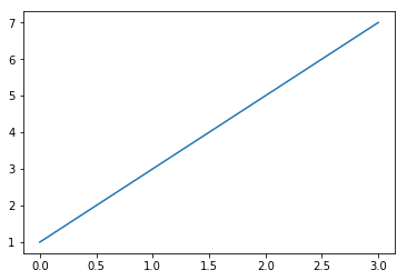
您可能想知道为什么x轴的范围是0-3, y轴的范围是1-7. 如果为plot()命令提供单个列表或数组, 则matplotlib假定它是一系列y值, 并自动为您生成x值. 由于python范围以0开头, 因此默认的x向量与y具有相同的长度, 但从0开始. 因此x数据为 [0,1,2,3].
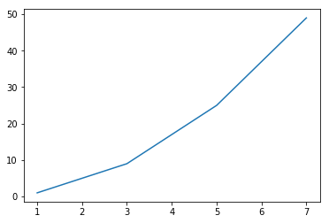
plot() 是一个多功能命令, 将采用任意数量的参数. 例如, 要绘制x与y的关系, 您可以发出命令:
1 | import matplotlib.pyplot as plt |
fmt的详细介绍
格式字符串由颜色、标记和线的部分组成:
fmt = ‘[color][marker][line]’
每一个参数都是可选的. 如果未提供, 则使用样式循环中的值.
例外情况:如果给出了行, 但没有标记, 则数据将是没有标记的行.
颜色(colors)
支持以下颜色缩写:
| 字符 | 颜色 | 字符 | 颜色 |
|---|---|---|---|
| ‘b’ | 蓝色 | ‘g’ | 绿色 |
| ‘r’ | 红色 | ‘c’ | 青绿色 |
| ‘m’ | 洋红色 | ‘y’ | 黄色 |
| ‘k’ | 黑色 | ‘w’ | 白色 |
| ‘#008000’ | RGB某颜色 | ‘0.8’ | 灰度值字符串 |
标记(markers)
| 字符 | 描述 |
|---|---|
| ‘.’ | point marker |
| ‘,’ | pixel marker |
| ‘o’ | circle marker |
| ‘v’ | triangle_down marker |
| ‘^’ | triangle_up marker |
| ‘<’ | triangle_left marker |
| ‘>’ | triangle_right marker |
| ‘1’ | tri_down marker |
| ‘2’ | tri_up marker |
| ‘3’ | tri_left marker |
| ‘4’ | tri_right marker |
| ‘s’ | square marker |
| ‘p’ | pentagon marker |
| ‘*’ | star marker |
| ‘h’ | hexagon1 marker |
| ‘H’ | hexagon2 marker |
| ‘+’ | plus marker |
| ‘x’ | x marker |
| ‘D’ | diamond marker |
| ‘d’ | thin_diamond marker |
| ‘|’ | vline marker |
| ‘_’ | hline marker |
曲线风格(line styles)
| 字符 | 描述 |
|---|---|
| ‘-‘ | solid line style |
| ‘–’ | dashed line style |
| ‘-.’ | dash-dot line style |
| ‘:’ | dotted line style |
例如:
1 | 'b' # blue markers with default shape |
**kwarg的详细介绍
**kwargs(可选参数)用于指定曲线特性, 下面给出一些可用的曲线特性:
| 属性 | 描述 |
|---|---|
| agg_filter | a filter function, which takes a (m, n, 3) float array and a dpi value, and returns a (m, n, 3) array |
| alpha | 透明度 float |
| animated | bool |
| antialiased | bool |
| clip_box | Bbox |
| clip_on | bool |
| clip_path | [(Path, Transform) / Patch / None] |
| color | color |
| contains | callable |
| dash_capstyle | {‘butt’, ‘round’, ‘projecting’} |
| dash_joinstyle | {‘miter’, ‘round’, ‘bevel’} |
| dashes | sequence of floats (on/off ink in points) or (None, None) |
| drawstyle | {‘default’, ‘steps’, ‘steps-pre’, ‘steps-mid’, ‘steps-post’} |
| figure | Figure |
| fillstyle | {‘full’, ‘left’, ‘right’, ‘bottom’, ‘top’, ‘none’} |
| gid | str |
| in_layout | bool |
| label | object |
| linestyle | {‘-‘, ‘–’, ‘-.’, ‘:’, ‘’, (offset, on-off-seq), …} |
| linewidth | float |
| marker | unknown |
| markeredgecolor | color |
| markeredgewidth | float |
| markerfacecolor | color |
| markerfacecoloralt | color |
| markersize | float |
| markevery | unknown |
| path_effects | AbstractPathEffect |
| picker | float or callable[[Artist, Event], Tuple[bool, dict]] |
| pickradius | float |
| rasterized | bool or None |
| sketch_params | (scale: float, length: float, randomness: float) |
| snap | bool or None |
| solid_capstyle | {‘butt’, ‘round’, ‘projecting’} |
| solid_joinstyle | {‘miter’, ‘round’, ‘bevel’} |
| transform | matplotlib.transforms.Transform |
| url | str |
| visible | bool |
| xdata | 1D array |
| ydata | 1D array |
| zorder | float |
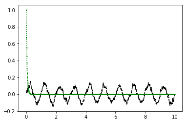
下面给出一些绘图实例:
1 | import matplotlib.pyplot as plt |
matplotblib.pyplot的细节设定
| 方法 | 描述 |
|---|---|
| plt.xlabel(xlabel, fontdict=None, labelpad=None, **kwargs) | 设置x轴标签 |
| plt.ylabel(ylabel, fontdict=None, labelpad=None, **kwargs) | 设置y轴标签 |
| plt.axis([xmin, xmax, ymin, ymax]) | 设定当前轴的范围 |
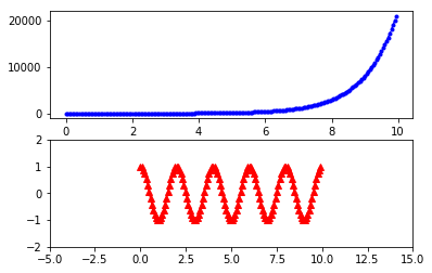
| plt.subplot(nrows, ncols, index) | 设定绘图区域 |
设置标签很容易理解, 而axis([xmin, xmax, ymin, ymax])中的参数为横纵坐标尺度, 如[-1, 10, 0, 6]设定横坐标从-1到10, 纵坐标从0到6. subplot(nrows, ncols, index)则是将整个绘图区域分为nrows个行, ncols个列绘图区; 而index表面当前绘图区域在从左到右从上到下的第index个绘图区.
例如:
1 | import matplotlib.pyplot as plt |
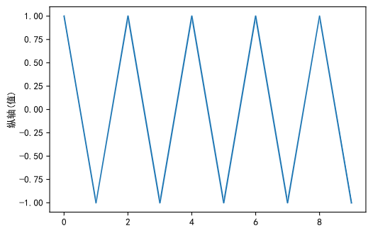
结果如图:
pyplot的中文显示
关于负号乱码问题, 使用 plt.rcParams['axes.unicode_minus'] = False 即可解决.
第一种方法: 修改全局字体
使用 plt.rcParams 修改全局字体
例如:
1 | import matplotlib.pyplot as plt |
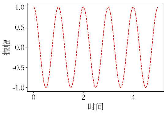
结果如图:
reParams的属性:
| 属性 | 描述 |
|---|---|
| ‘font.family’ | 用于显示字体的名字 |
| ‘font.style’ | 字体风格, 正常’normal’或斜体’italic’ |
| ‘font.size’ | 字体大小, 整数字号或者’large’、’x-small’ |
| 中文字体 | 描述 |
|---|---|
| ‘SimHei’ | 中文黑体 |
| ‘Kaiti’ | 中文楷体 |
| ‘LiSu’ | 中文隶书 |
| ‘FangSong’ | 中文仿宋 |
| ‘YouYuan’ | 中文幼圆 |
| ‘STSong’ | 华文宋体 |
再例如:
1 | import matplotlib.pyplot as plt |
结果如图:
第二种方法: 修改当前字体
在有中文输出的地方, 增加一个属性: fontproperties.
在上一个例子中, 我们可以用第二种方法重写:
1 | import matplotlib.pyplot as plt |
结果和上一个例子是一样的.
这里推荐使用不改变全局变量的情况下修改字体, 即第二种方法, 可以避免一些不必要的错误.